04. Absolute vs. Relative Frequency
L3 041 Absolute V Relative Frequency V5
DataVis L3 04 V2
Absolute vs. Relative Frequency
By default, seaborn's countplot function will summarize and plot the data in terms of absolute frequency, or pure counts. In certain cases, you might want to understand the distribution of data or want to compare levels in terms of the proportions of the whole. In this case, you will want to plot the data in terms of relative frequency, where the height indicates the proportion of data taking each level, rather than the absolute count.
One method of plotting the data in terms of relative frequency on a bar chart is to just relabel the count's axis in terms of proportions. The underlying data will be the same, it will simply be the scale of the axis ticks that will be changed.
Example 1. Demonstrate data wrangling, and plot a horizontal bar chart.
Example 1 - Step 1. Make the necessary import
import numpy as np
import pandas as pd
import matplotlib.pyplot as plt
import seaborn as sb
%matplotlib inline

# Read the data from a CSV file
pokemon = pd.read_csv('pokemon.csv')
print(pokemon.shape)
pokemon.head(10)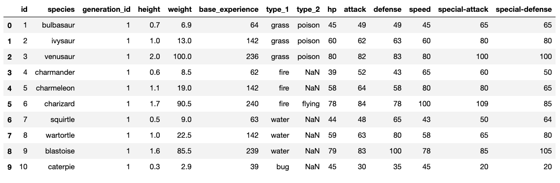
Last time we created the bar chart of pokemon by their type_1. Let's club the rows of both type_1 and type_2, so that the resulting dataframe has new column, type_level.
This operation will double the number of rows in pokemon from 807 to 1614.
Data Wrangling Step
We will use the pandas.DataFrame.melt() method to unpivot a DataFrame from wide to long format, optionally leaving identifiers set. The syntax is:
DataFrame.melt(id_vars, value_vars, var_name, value_name, col_level, ignore_index)It is essential to understand the parameters involved:
id_vars- It is a tuple representing the column(s) to use as identifier variables.value_vars- It is tuple representing the column(s) to unpivot (remove, out of place).var_name- It is a name of the new column.value_name- It is a name to use for the ‘value’ of the columns that are unpivoted.
Refer here for more details on the parameters.
The function below will do the following in the pokemon dataframe out of place:
- Select the 'id', and 'species' columns from pokemon.
- Remove the 'type_1', 'type_2' columns from pokemon
- Add a new column 'type_level' that can have a value either 'type_1' or 'type_2'
- Add another column 'type' that will contain the actual value contained in the 'type_1', 'type_2' columns. For example, the first row in the pokemon dataframe having
id=1andspecies=bulbasaurwill now occur twice in the resulting dataframe after themelt()operation. The first occurrence will havetype=grass, whereas, the second occurrence will havetype=poison.
Example 1 - Step 2. Data wrangling to reshape the pokemon dataframe
pkmn_types = pokemon.melt(id_vars=['id', 'species'],
                          value_vars=['type_1', 'type_2'],
                          var_name='type_level',
                          value_name='type')
pkmn_types.head(10)
#pkmn_types.shape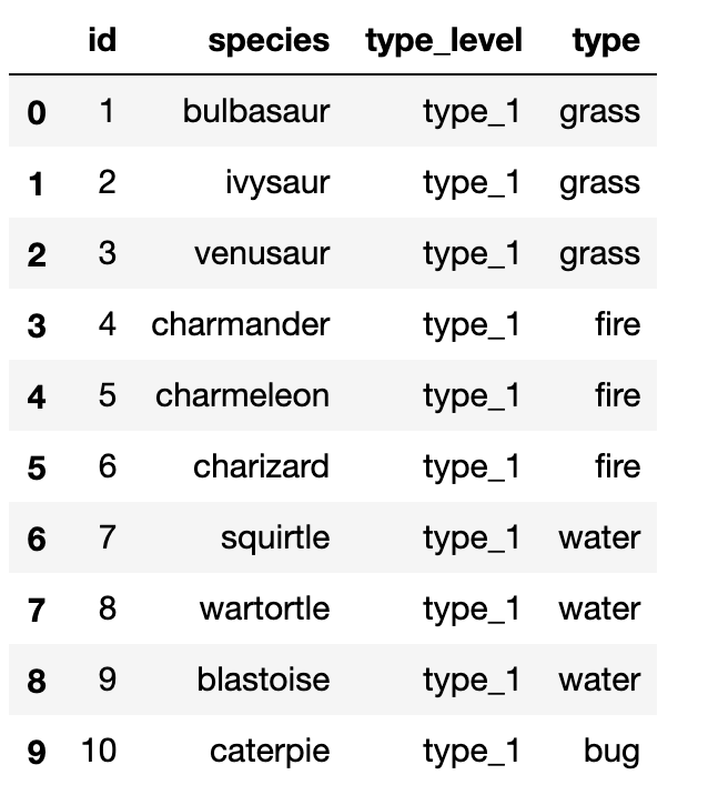
Example 1 - Step 3. Find the frequency of unique values in the type column
# Count the frequency of unique values in the `type` column of pkmn_types dataframe.
# By default, returns the decreasing order of the frequency.
type_counts = pkmn_types['type'].value_counts()
type_counts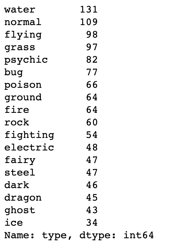
# Get the unique values of the `type` column, in the decreasing order of the frequency.
type_order = type_counts.index
type_order
Index(['water', 'normal', 'flying', 'grass', 'psychic', 'bug', 'poison',
'ground', 'fire', 'rock', 'fighting', 'electric', 'fairy', 'steel', 'dark', 'dragon', 'ghost', 'ice'],
dtype='object')
Example 1 - Step 4. Plot the horizontal bar charts
base_color = sb.color_palette()[0]
sb.countplot(data=pkmn_types, y='type', color=base_color, order=type_order);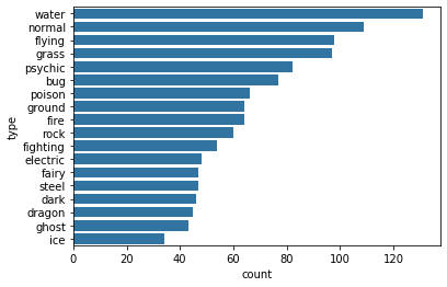
Example 2. Plot a bar chart having the proportions, instead of the actual count, on one of the axes.
Example 2 - Step 1. Find the maximum proportion of bar
# Returns the sum of all not-null values in `type` column
n_pokemon = pkmn_types['type'].value_counts().sum()

# Return the highest frequency in the `type` column
max_type_count = type_counts[0]

# Return the maximum proportion, or in other words,
# compute the length of the longest bar in terms of the proportion
max_prop = max_type_count / n_pokemon
print(max_prop)
0.1623296158612144
Example 2 - Step 2. Create an array of evenly spaced proportioned values
# Use numpy.arange() function to produce a set of evenly spaced proportioned values
# between 0 and max_prop, with a step size 2\%
tick_props = np.arange(0, max_prop, 0.02)
tick_props
array([0. , 0.02, 0.04, 0.06, 0.08, 0.1 , 0.12, 0.14, 0.16])
We need x-tick labels that must be evenly spaced on the x-axis. For this purpose, we must have a list of labels ready with us, before using it with plt.xticks() function.
Example 2 - Step 3. Create a list of String values that can be used as tick labels.
# Use a list comprehension to create tick_names that we will apply to the tick labels.
# Pick each element `v` from the `tick_props`, and convert it into a formatted string.
# `{:0.2f}` denotes that before formatting, we 2 digits of precision and `f` is used to represent floating point number.
# Refer [here](https://docs.python.org/2/library/string.html#format-string-syntax) for more details
tick_names = ['{:0.2f}'.format(v) for v in tick_props]
tick_names
['0.00', '0.02', '0.04', '0.06', '0.08', '0.10', '0.12', '0.14', '0.16']
The xticks and yticks functions aren't only about rotating the tick labels. You can also get and set their locations and labels as well. The first argument takes the tick locations: in this case, the tick proportions multiplied back to be on the scale of counts. The second argument takes the tick names: in this case, the tick proportions formatted as strings to two decimal places.
I've also added a ylabel call to make it clear that we're no longer working with straight counts.
Example 2 - Step 4. Plot the bar chart, with new x-tick labels
sb.countplot(data=pkmn_types, y='type', color=base_color, order=type_order);
# Change the tick locations and labels
plt.xticks(tick_props * n_pokemon, tick_names)
plt.xlabel('proportion');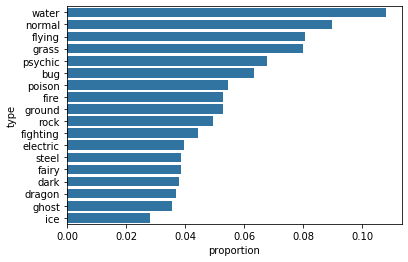
Additional Variation
Rather than plotting the data on a relative frequency scale, you might use text annotations to label the frequencies on bars instead. This requires writing a loop over the tick locations and labels and adding one text element for each bar.
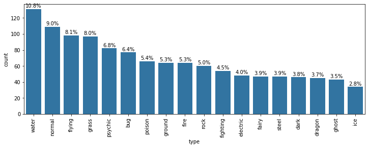
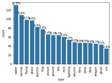
Example 3. Print the text (proportion) on the bars of a horizontal plot.
# Considering the same chart from the Example 1 above, print the text (proportion) on the bars
base_color = sb.color_palette()[0]
sb.countplot(data=pkmn_types, y='type', color=base_color, order=type_order);

# Logic to print the proportion text on the bars
for i in range (type_counts.shape[0]):
    # Remember, type_counts contains the frequency of unique values in the `type` column in decreasing order.
    count = type_counts[i]
    # Convert count into a percentage, and then into string
    pct_string = '{:0.1f}'.format(100*count/n_pokemon)
    # Print the string value on the bar.
    # Read more about the arguments of text() function [here](https://matplotlib.org/3.1.1/api/_as_gen/matplotlib.pyplot.text.html)
    plt.text(count+1, i, pct_string, va='center')
Example 4. Print the text (proportion) below the bars of a Vertical plot.
# Considering the same chart from the Example 1 above, print the text (proportion) BELOW the bars
base_color = sb.color_palette()[0]
sb.countplot(data=pkmn_types, x='type', color=base_color, order=type_order);


# Recalculating the type_counts just to have clarity.
type_counts = pkmn_types['type'].value_counts()

# get the current tick locations and labels
locs, labels = plt.xticks(rotation=90)

# loop through each pair of locations and labels
for loc, label in zip(locs, labels):

    # get the text property for the label to get the correct count
    count = type_counts[label.get_text()]
    pct_string = '{:0.1f}%'.format(100*count/n_pokemon)

    # print the annotation just below the top of the bar
    plt.text(loc, count+2, pct_string, ha = 'center', color = 'black')
I use the .get_text() method to obtain the category name, so I can get the count of each category level. At the end, I use the text function to print each percentage, with the x-position, y-position, and string as the three main parameters to the function.
Tip - Is the text on the bars not readable clearly? Consider changing the size of the plot by using the following:
from matplotlib import rcParams
# Specify the figure size in inches, for both X, and Y axes
rcParams['figure.figsize'] = 12,4